The designer's best-kept secret.
It's an ad for a popular stock image website. Or a UI kit for designers. I can't remember.
Using a pre-made website template in WordPress or Webflow might seem easy. But you need to
understand the WHYs behind certain design decisions to make a good landing page.
I'll give you the basics. After all, pre-processed food is always worse than a home-cooked meal.
Alignment
You can't throw things at the website and hope they will arrange themselves. One of the basic
principles you can use is alignment.
Alignment helps organize and unify content on a website. Alignment creates a visual connection.
It's also easier on your visitor's eyes and brain if used properly.
There are 3 basic alignment types. Left-aligned, Centered, and
Right-aligned.
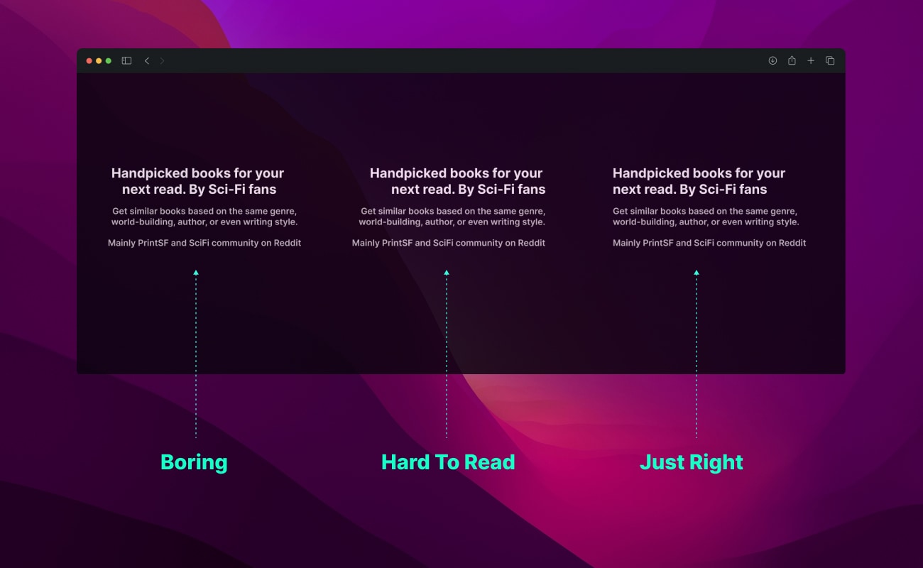
Centered is the most boring one. Also overused by new and non-designers. It's easy and cheap.
Try to avoid it if possible.
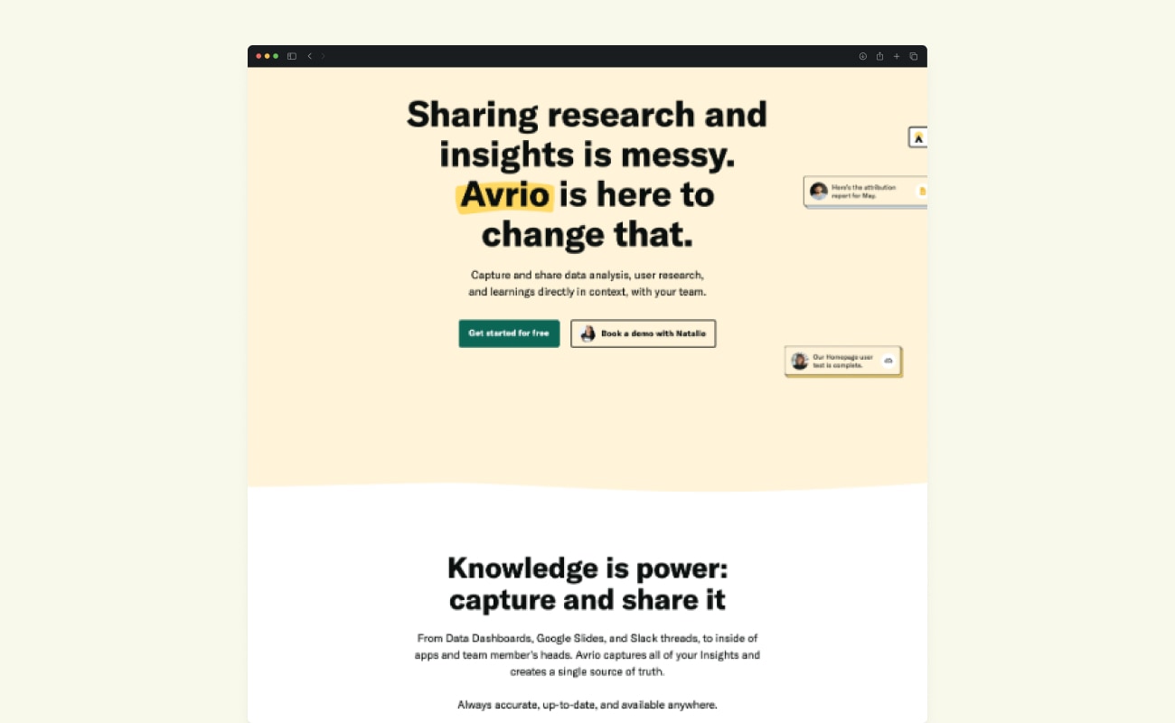
Avrio.com had the original design with centered text
Left-aligned is arguably the most popular one. And for good reason.
Most people read left to right. Left-alignment helps them follow a straight line to progress to
the next section below.
It's also a good idea to add other elements aligned to the left like forms,
images, and buttons. Not only blocks of text.
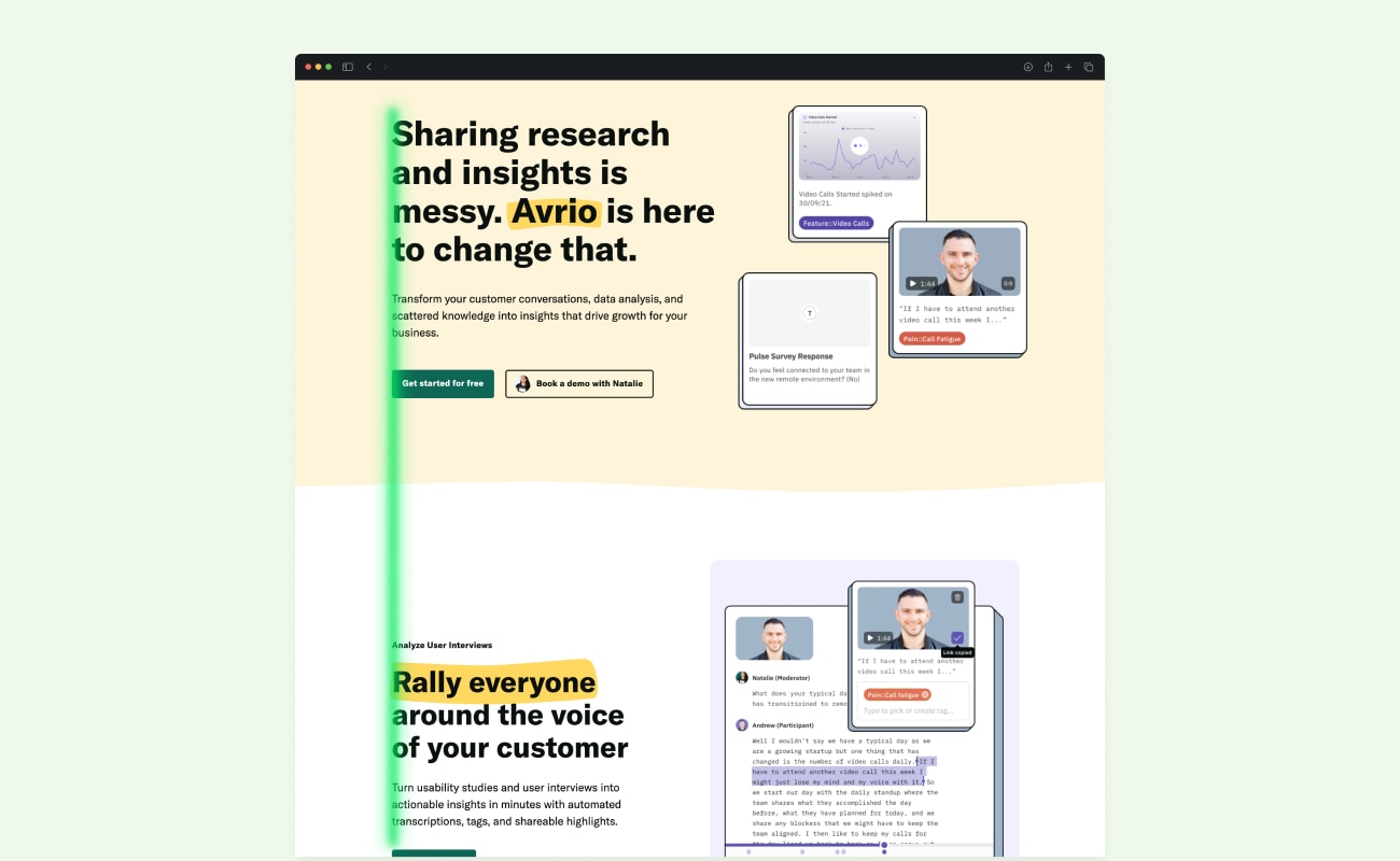
That's not to say that you can't have 2 or more left-aligned blocks.
But be conscious that people will scan the first one and then switch to the second one on the
right. That's just how reading habits work.
To keep things simple: use one left-aligned block. Imagine an invisible line.
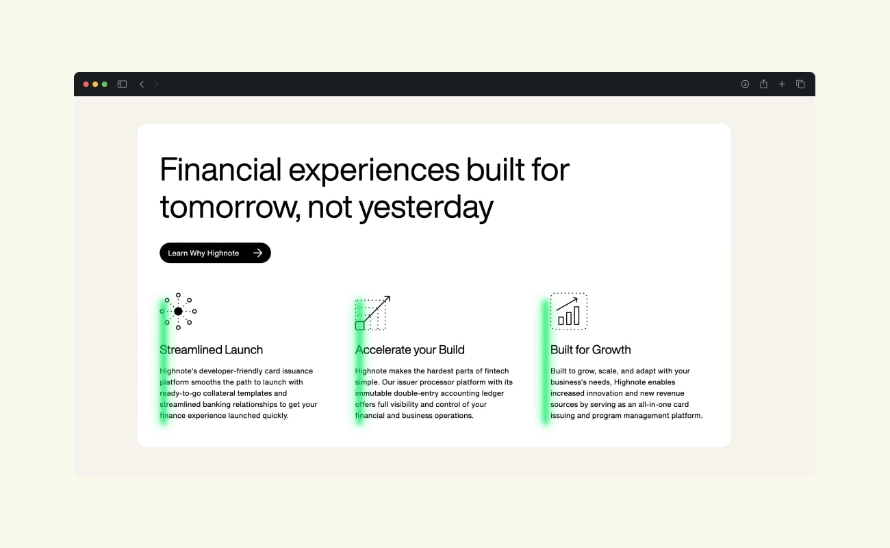
Use the ruler feature of your design tools like Figma or Sketch and snap elements to it precisely.
Avoid right-aligned text for the time being. If you still have to: use short text. People will have to jump while moving to the next line. It's worse when you have a long text.
Grouping
The most powerful thing you can do to create a good design is group together elements that are
related. It seems common sense but is often forgotten.
Not the fancy animations, the parallax effects, and blurry backgrounds. Grouping is actually
more impactful.
You may notice that we take certain groupings on a website for granted. Navigation links, feature lists, social proof cards, and so on. It works.
Humans have evolved to identify patterns. It gives us comfort and less load on our brain when getting new information.
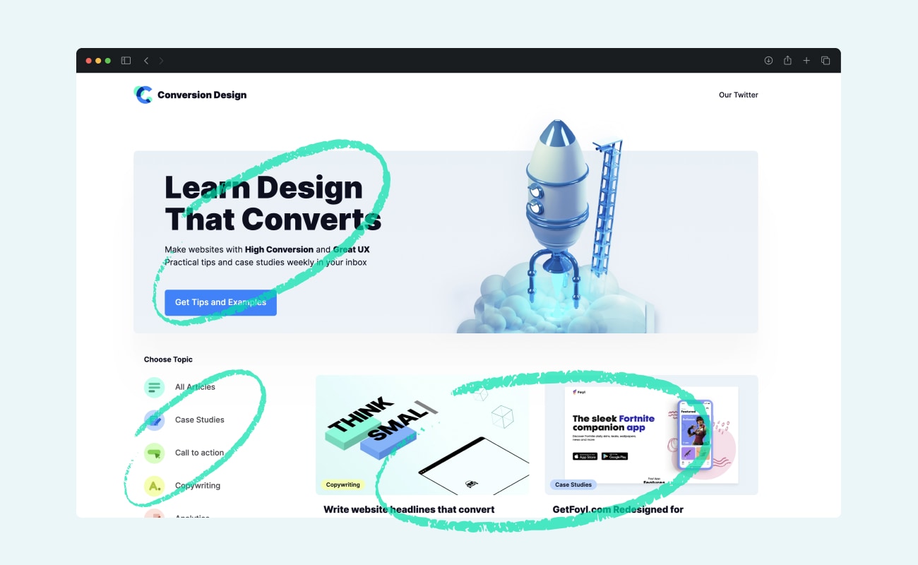
Grouping is done by: closeness and similarity.
Closeness is self-explanatory: organizing common elements together spatially.
You can also group smaller groups.
For example, a social card has an image of the person, the name and title, and a short blurb
about your product.
Many cards can be grouped in one social proof section. Use a
maximum of 7 elements
in a group.
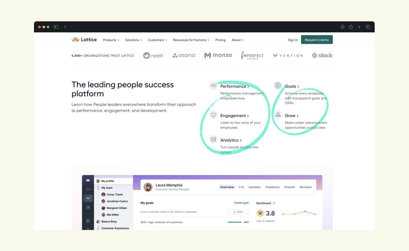
The similarity is grouping by the same visual aesthetic.
All headlines or sub-headlines should have the same font size and weight. H1 and H2. Or images
should have the same corner radius.
All this creates a sense of unity in your website. People need to learn once how your
sub-headline looks. Don't make them think more than they need.
Repetition
Repetition is grouping's older brother.
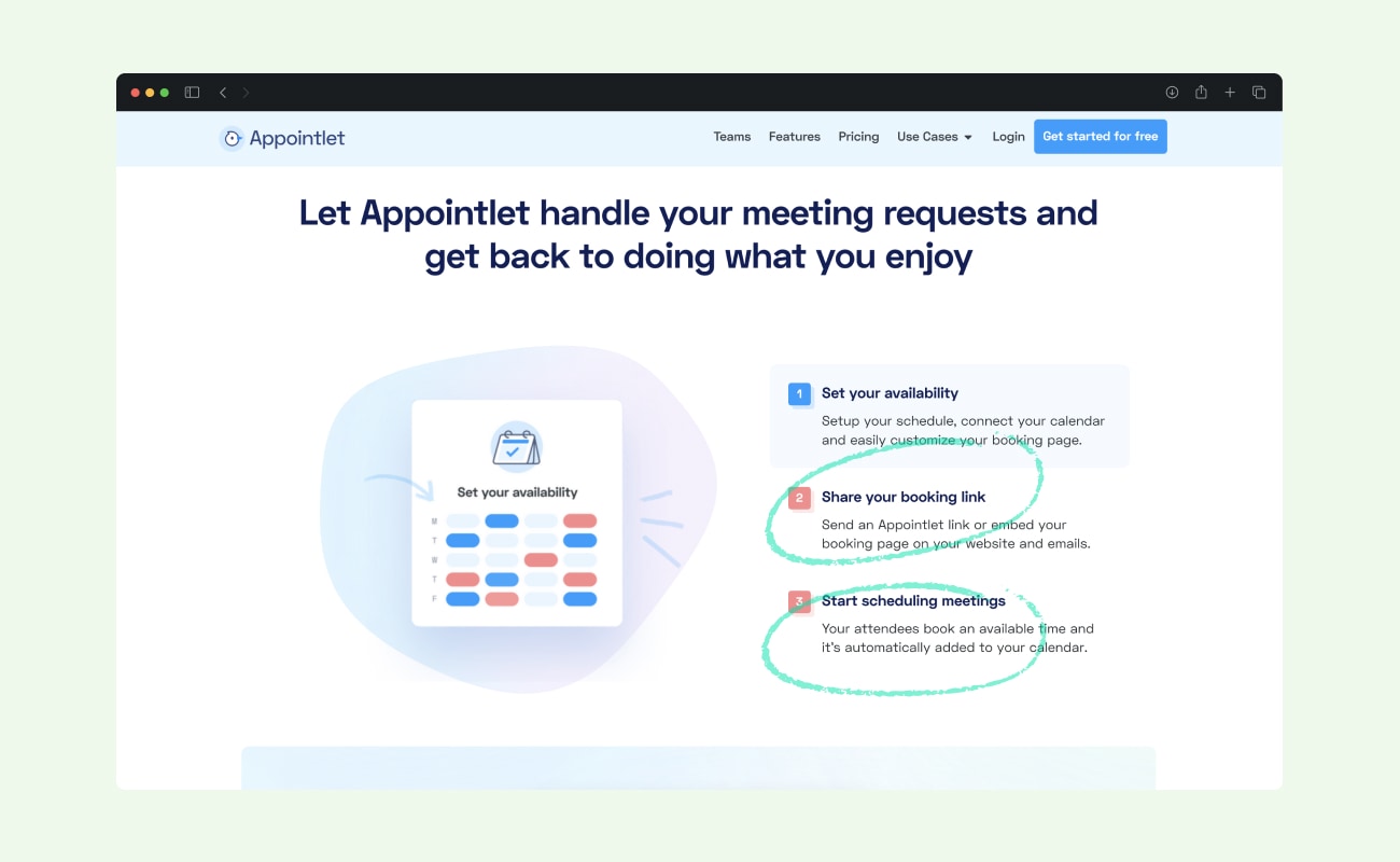
It's applying the same perspective of defining a thing once. Then duplicate it on different
pages.
Not only do people not have to learn what the purpose of this element or text is again. It also
makes it easier to design or build pages. You need to design it once.
Once you've designed your layout and style, use the same one for other pages. Same spacing, same
alignment (left one I hope), same size, and font weight.
If you're worried about being boring, the next point handles it.
Contrast
Now that you've learned all the rules. It's time to break them. You can only break the rules once you know them though.
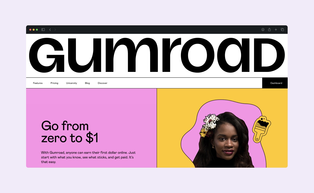
Design's goal is to grab someone's attention and contrast is our best friend for that.
When you want to bring focus to something, make it stand out. And I mean by a lot. Be bold.
Create contrast by
- Position
Make it not aligned to other elements. But make sure it's obvious and not a rookie mistake. Misalign by a lot. - Color
Make it truly distinct and vibrant. Different from other elements on your page. - Size
This is my favorite one. Make something 2 or 3 times the size that it should be. Or even more.
You can use all these methods combined once you get more experience.
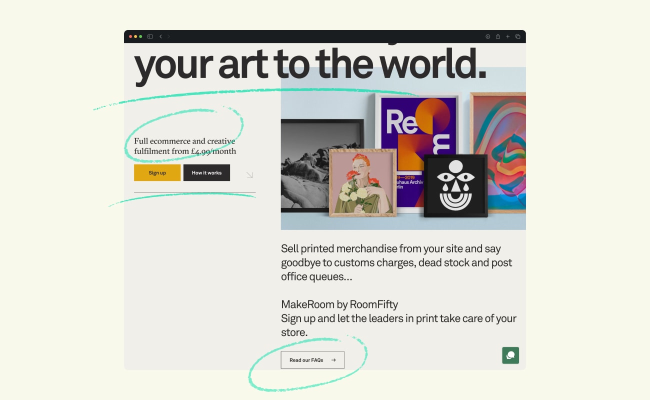
Here's an example of contrast usage by the team at MakeRoom. Notice the difference between Headline and body text. The difference in alignment and color of buttons.
🐟 Just give me the fish
Left-align your element on the page. Especially text.
Group things that belong together logically like navigation buttons.
Create one style for your elements: Headline has the same size, color, and style.
Grab attention by making one element stand out by breaking all these rules. Don't be timid about it.